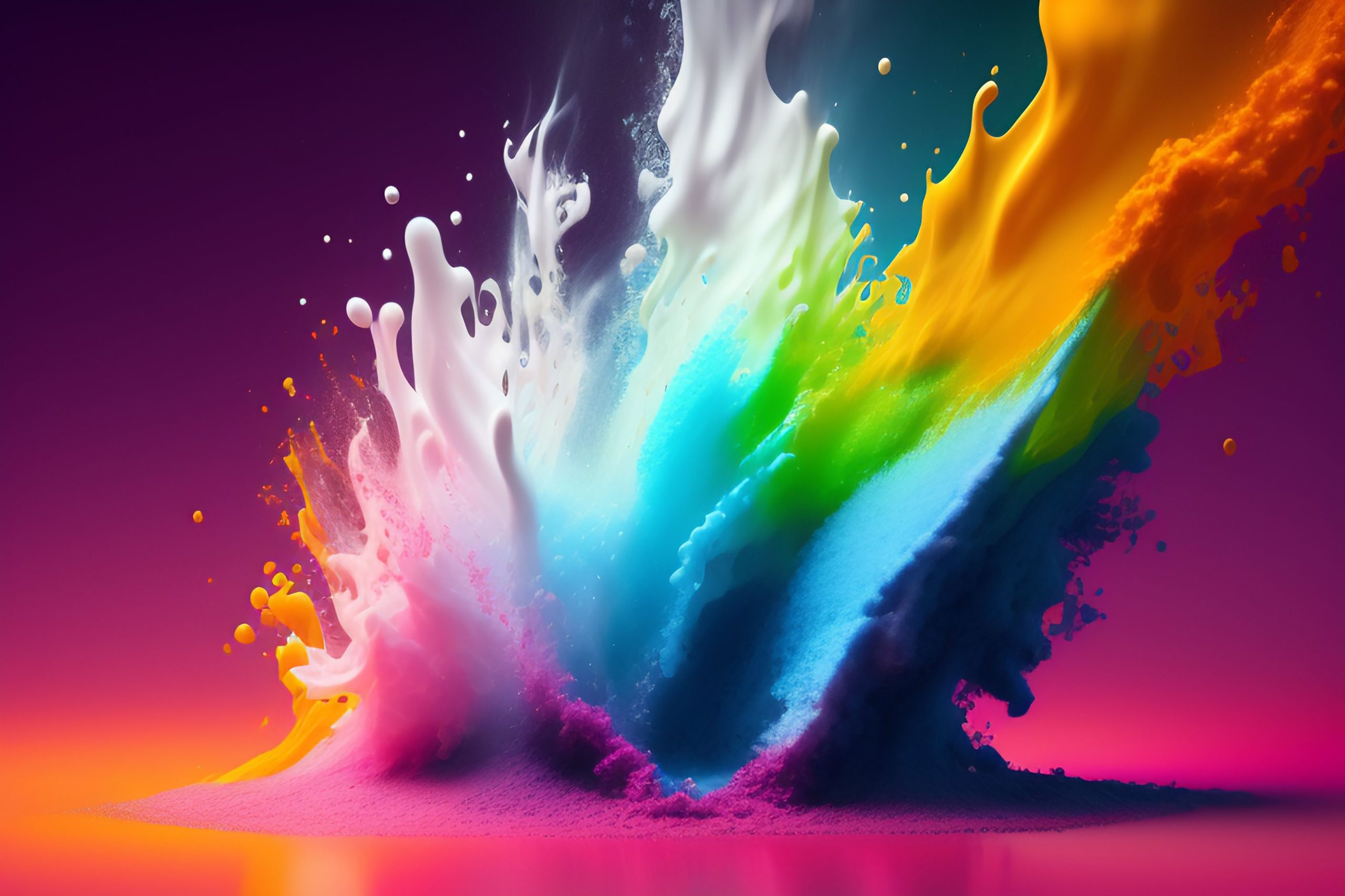
Power of colours
Colours play a vital role in UI design as they can influence how users perceive and interact with a website or application. Whether consciously or subconsciously, colours have the power to evoke emotions, convey meaning, and communicate information. In this article, we’ll explore the power of colours in UI design and how they can enhance the user experience.
Emotions and Associations Colors can evoke specific emotions and associations. For example, warm colours such as red, orange, and yellow are often associated with energy, excitement, and passion. Cooler colours like blue, green, and purple, on the other hand, are more calming and soothing. It’s essential to consider the emotions and associations that different colours convey and choose them accordingly to reflect the tone and personality of your brand.
Branding and Identity Colors play a crucial role in branding and identity. By consistently using a specific colour palette, you can build brand recognition and create a unique identity for your website or application. Using the right colours can help users recognize and remember your brand, making it easier for them to return and engage with your product.
User Experience and Accessibility Colors can also impact the user experience and accessibility of a website or application. The use of colour can make it easier for users to navigate through the interface, understand the hierarchy of content, and interact with buttons and links. However, it’s essential to consider colourblindness and other visual impairments when choosing colours for your UI design. Using high-contrast colours and avoiding relying solely on colour to convey important information can help make your design more accessible.
Call to Action and Conversion Colors can be used strategically to encourage users to take specific actions on your website or application. Bright, contrasting colours are often used for calls to action (CTAs) to draw users’ attention and encourage them to click. Additionally, different colours can be used to communicate different meanings. For example, a green CTA may suggest that an action is positive or successful, while a red CTA may suggest an error or warning.
Aesthetic Appeal and User Engagement
Finally, colours can enhance the aesthetic appeal and user engagement of a website or application. A well-designed colour palette can make a website or application look more polished and professional, while also helping to create a cohesive design. Using bright, bold colours can also make a website or application feel more engaging and fun, which can encourage users to spend more time interacting with your product.
In conclusion, the power of colours in UI design cannot be underestimated. By using the right colours strategically, you can evoke emotions, communicate information, build brand recognition, enhance the user experience and accessibility, encourage conversions, and increase user engagement. When designing your next website or application, remember to consider the power of colours and use them to your advantage.
.